Packaging, Brand Mark, and Typeface Development
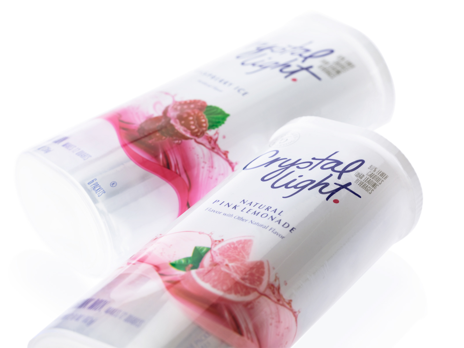
The goal of this work was to give Crystal Light a total makeover making it relevant to women today. The graphic solution gave the pack a clean, fresh contemporary look and feel by enhancing the amount of white on the pack and stripping away all extraneous elements. A vibrant and more expressive logo replaced the existing harsh and dated brand mark, giving the brand a friendly and trustworthy endorsement. The new fresh and contemporary look helped the brand to stake its claim as a leading hydration option for women today.

Logo Before and After

Packaging Before and After